WSI INTRODUCES A NEW BRAND IDENTITY


Our new identity reflects the strength, precision and energy of WSI today and the ambition of where we are going next.​ 

From more than 48 years of engineering expertise to the next chapter of WSI_

Our business has been shaped by specialist engineering, advanced technology and people who know how to execute when reliability, safety and performance matter most. From specialized welding and engineered repair solutions to protecting critical infrastructure and extending the life of essential assets, WSI has grown by helping customers solve challenges where conventional answers are often not enough. ​

​Over that time, our capabilities have evolved. Our technology has advanced. Our reach has expanded. The industries we serve have changed and the challenges our customers ask us to solve have become increasingly complex.​

​Now our brand is evolving too.​​

Modernizing our identity without leaving our history behind_
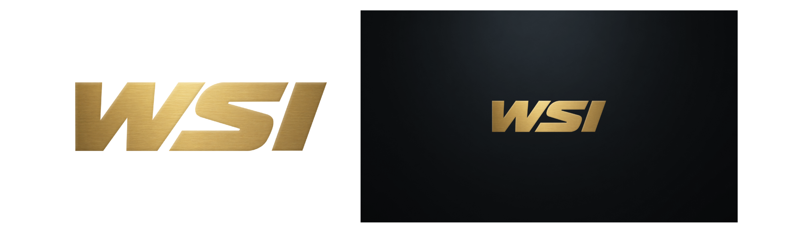
A new identity does not mean leaving the old WSI behind. Quite the opposite. The reputation behind these three letters was built over decades by our people, our customers and the work delivered in the field. Our primary identity now moves forward in Midnight Navy and Alloy Silver but an important part of WSI's history will remain. Our historic black and gold colour-way has been retained as the WSI Heritage Collection, reserved for selected merchandise, campaigns and milestone moments. It gives us a way to celebrate more than four decades of WSI while allowing the primary identity to move confidently into its next chapter. We are not replacing our heritage. We are building on it.​​​

Bringing our new brand to life_

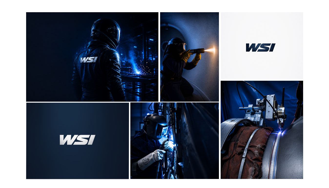
This is more than a new look; it’s a consistent way of presenting WSI to the world. Our visual identity brings our people, capabilities and engineering expertise together under one recognizable brand. From digital communications to site-level applications, every touchpoint will help build a clearer, stronger picture of who we are and what we deliver.​

“WSI has been built over 48 years, one project, one outage and one customer at a time. There is a confidence that comes with the WSI name... this new identity respects that history while better reflecting the company we are today and the direction we are heading. The logo may be new, but the reputation behind those three letters has been earned over decades by our people, our customers and the work we deliver every day.”

Bill Ruta, CEO
Behind the logo is a story_
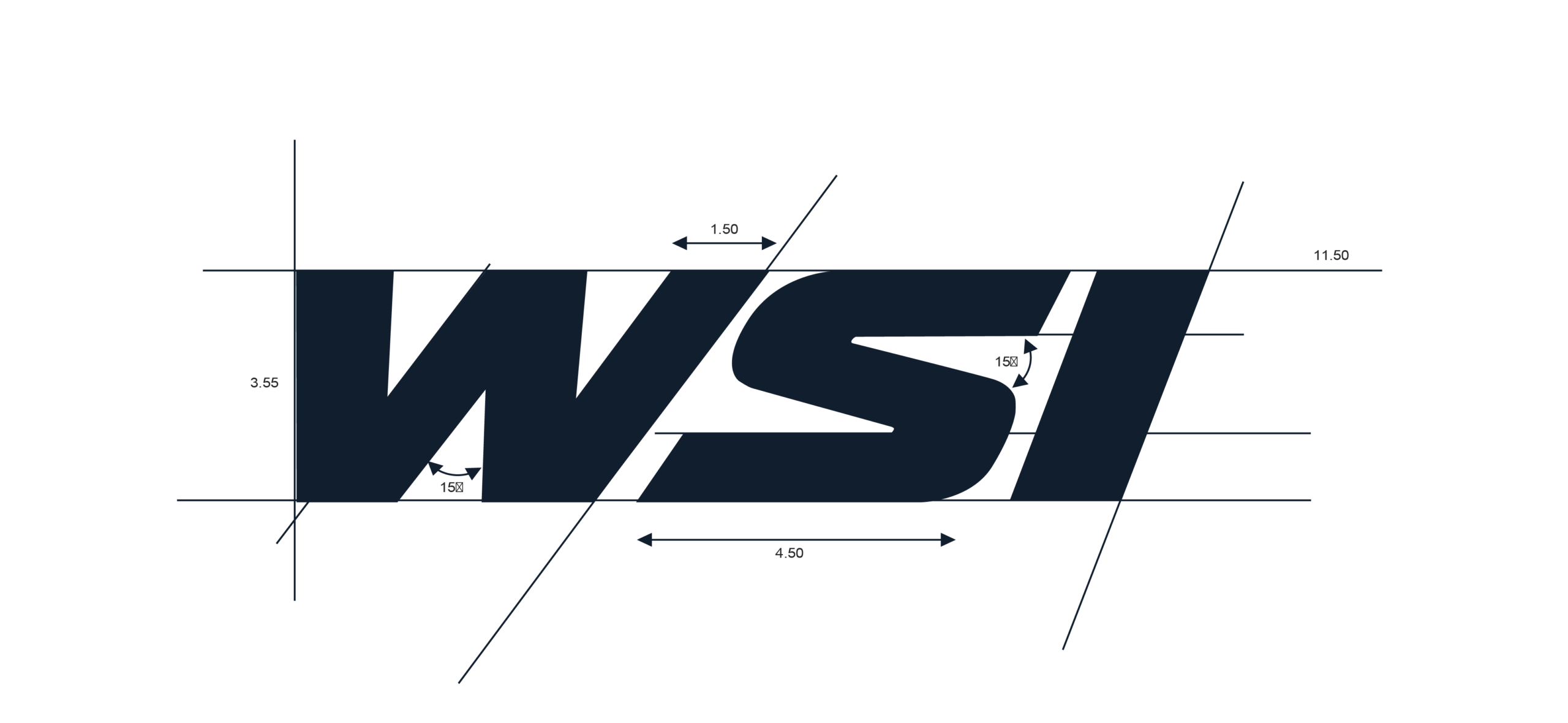
The new WSI logo combines industrial strength with modern precision. Its bold, forward-leaning form reflects momentum, confidence and a business that does not stand still, while the metallic finish connects the brand to engineering, workmanship and precision. Deliberate asymmetry reflects the realities of the environments we work in, where WSI engineers dependable solutions from complexity, constraints and imperfect conditions.​

01 | Direction

The forward-leaning
form reflects a
company that moves
with intent. It shows
our momentum,
progress and a
business that does
not stand still.​

02 | Type

The bold,
heavyweight type
demonstrates our
industrial
authority. It’s
engineered, solid
and dependable -
reflecting the
robust solutions
WSI deliver.​

03 | Balance

The logo balances
industrial strength
with modern
precision. It
reflects WSI rooted
in hands-on
delivery, yet
evolved for a more
sophisticated,
forward-looking
solution.​

04 | Texture

The metallic finish
fabricates the
engineered feel -
connecting WSI
and customers
visually to our
materials,
workmanship and
precision.​

05 | Asymmetry

Asymmetry reflects
the practical truth WSI
environments : real-
world challenges are
rarely neat or perfect.
WSI engineers
solutions from
complexity,
constraints and
imperfect starting
points.​